Content Blocks Overview#
A content block is a reusable unit of content that can be used to build digital assets, like emails or landing pages. Each block contains different elements such as text, images, video links, social media links, or even buttons. This approach allows for consistency in design and branding across various platforms and communications.
Each block consists of various fields and some blocks like our 'General Content' block can utilize components. This block encapsulates the components to create a content rich section.
You can reorder the blocks via drag-and-drop.
Header#
The Header displays heading text and a selected number of components over a background image or video. It also allows for button links. If the video upload does not work for whatever reason, the image will be used as a fallback.

Features#
- Content:
- Breadcrumb:
- Headline: Main headline of the block
- Backdrop:
- Image:
- Art Directed Header Image: Choose backdrop image for different devices and resolutions
- Video: Choose backdrop video
- Block Settings:
- Has Jumbo Headline: This makes the headline larger
- Remove Bottom Padding: Remove the block's bottom padding
- Image:
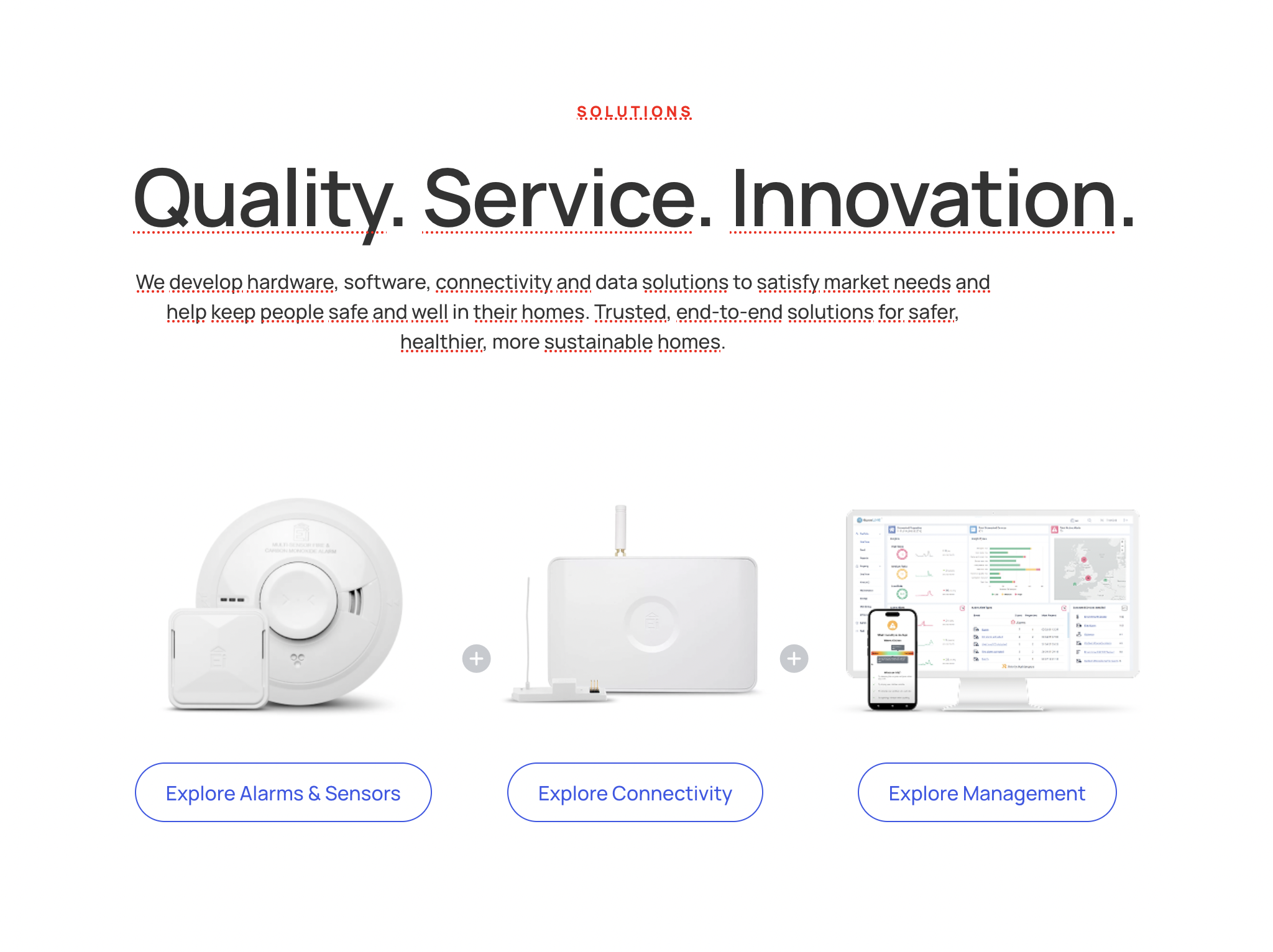
General Content#
The General Content Block is a flexible and customizable section that allows the combination of various components to create a wide array of layouts.
There is a list of components to choose from when deciding on how to build this block. You can also drag and drop components to reorganize them as you wish.
Patterns#
Patterns allow users to create reusable content blocks that can be easily updated and applied across various parts of the site.
When building a page, you can then access the global block like so:

Card#
The Card Block displays a chosen image with a choice of components to display over it.
Features#
- Styles: Choice of alignment of block content
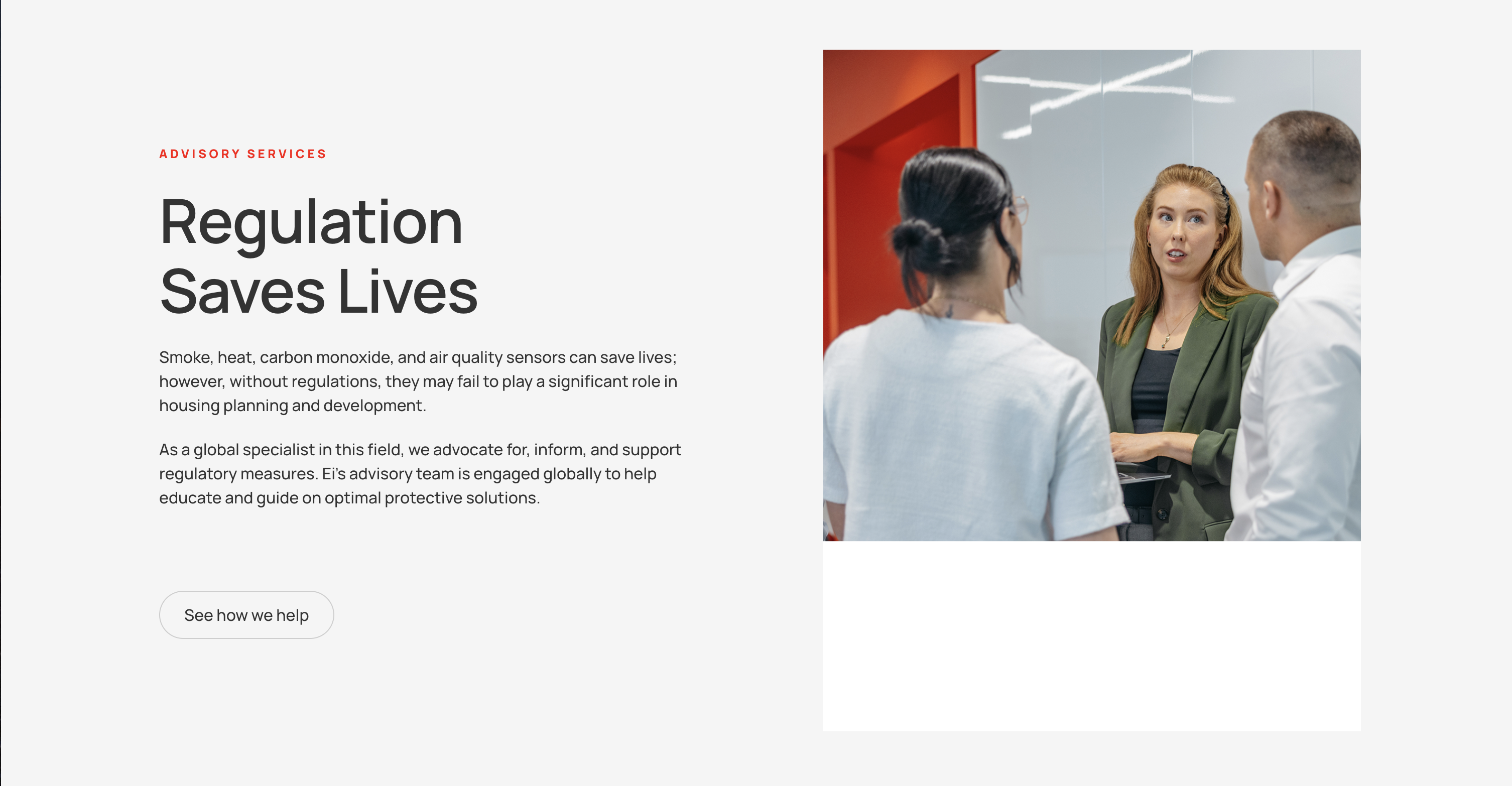
Dual#
The Dual Block displays two columns which can be populated with various components.
Features#
- Block Settings:
- Column Split: Select the desktop layout for the two columns.
- Reverse on Mobile: Display the right column before the left column on mobile screens.
- Remove Top Padding: Remove top padding
- Remove Bottom Padding: Remove bottom padding
Team Grid#
The Team Grid Block displays a grid of chosen team members.

Features#
- Section Heading: Heading displayed above team grid.
- Team: Team members can be added here, with specified Portrait, Name, Title, and LinkedIn for each
- Block Settings:
- Remove Bottom Padding: Remove bottom padding
Index#
The Index Block displays posts of a selected post type, or a manually selected number of posts.

Features#
- Title: Title displayed at the top of the block
- Introduction: Introductory text displayed below the title
- Manual Selection: Choose whether to choose the posts manually or not. A dropdown menu of posts will show if this is selected
- Post Type: Choose the post type of the displayed posts
Form#
The Form block displays a chosen form from a list of existing forms. The users can fill out the form which is then sent to the desired form recipient.

Features#
- Form Title: The title displayed above the form
- Form Description: The description of the form, displayed below the title
- Form: The author can choose from a list of existing forms
- Form Footer Text: The footer text dispolayed below the form
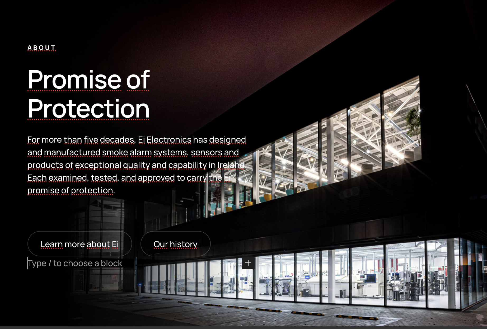
Hero#
The Hero content block creates a banner image or video with optional text content.

Stats#
The Stats block is used to showcase key numerical data or achievements in a visually appealing way.

Features#
- Stats Section Introduction: Introductory text displayed above the stats.
- Stats:
- Number: The number displayed
- Suffix: The symbol after the number, e.g. +
- Label: The text below the number and suffix
- Text: The text description below the stat values
Testimonial#
The Testimonial block is used to showcase customer feedback, client experiences, or success stories. It helps build trust and credibility by displaying authentic reviews and endorsements from satisfied clients.

Features#
- Quote: Sets the text quote for the block
- Attribution: Sets the attributor who is quoted to have said the text quote
Trailer#
The Trailer block is used to display a chosen number of posts.

Features#
- Trailer Title: The title displayed above the posts
- Content Selection: Show the 3 most recent posts or a custom selection of posts
Contact Section#
The Contact Section block is a collapsable section which shows some contact details and a pre-existing contact form.

Features#
- Section Title: Title of the contact section
- Contact Details: The contact details to be shown in the left column of the block
- Form: The pre-existing form to be shown in the right column of the block
Careers#
The Careers block is used to list out a number of vacancies within the organization.

Features#
- Title: The main heading for the careers section, typically something like "Open Roles".
- Headline: Headline shown below the title.
Careers Intro#
The Careers Intro block is used to display various members in the company and provide a short intro describing the team and inviting visitors of the site to apply for open roles.

Features#
- Art Directed Image: Choice of image for various devices and resolutions.
Careers Footer#
The Careersfooter

Features#
- Headline: Headline of the block
- Message: Text displayed below headline, beside instagram logo
- Art Directed Header Image: Choice of image for various devices and resolutions.
Box CTA#
The Box CTA block is used to display

Features#
- Box Image: Image displayed.
- Object Fit: Choose whether the image should span the whole height of the inner block or not.
- Image below content on mobile: Choice to display the image below the content on mobile devices.
Timeline#
The Timeline block is used to display

Features#
- Headline: The main heading for the timeline section.
- Text: Introductory or descriptive text displayed below the headline.
- Cards:
- Year: The year or date associated with the card.
- Heading: The title for the individual card.
- Text: A short description or details about the timeline event.
- Image: Optional image or illustration to accompany the card.