Button#
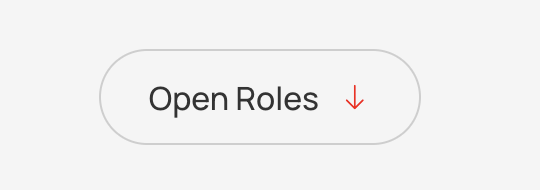
Adds button to url, downloadable content, or on-page elementc.
Features#
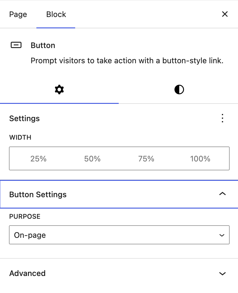
- Settings:
- Width: Choice of button width
- Button Settings:
- Purpose: Choice of Normal, Download, or On-page
Separator#
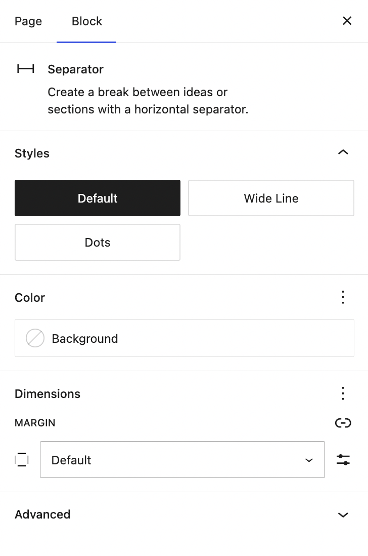
Inserts a separating line between the components.

Features#
- Styles: Set the style of the line. Choose between Default, Wide-line, and Dots.
Spacer#
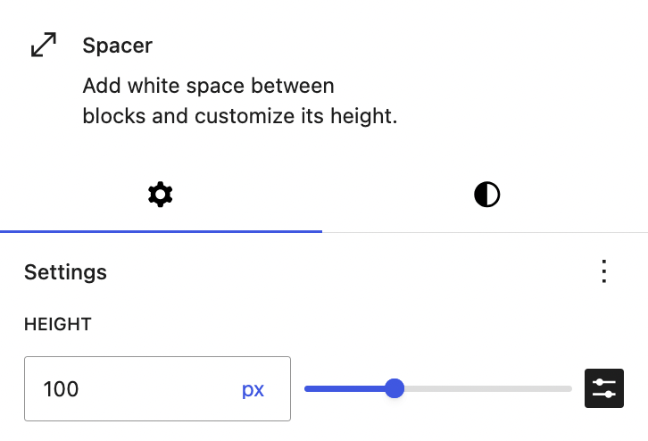
Inserts a separating space between the components.

Features#
- Height: Set the height of the spacer.
Form#
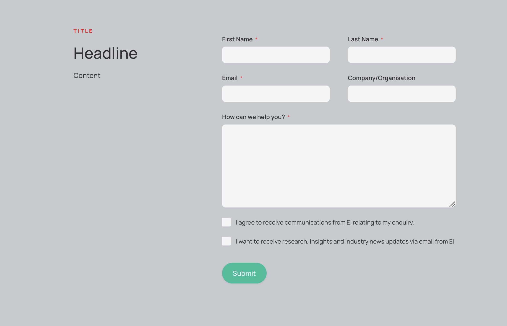
Inserts a form, this can be picked from a drop down list of form options.
Features#
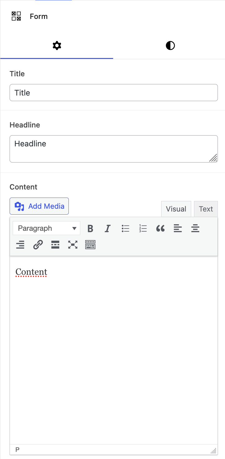
- Title: The main title displayed in the top left of the block
- Headline: The healdine displayed below the title
- Content: Text content below the headline
- Hide Contact Details:
- Form: Choice of pre-existing forms
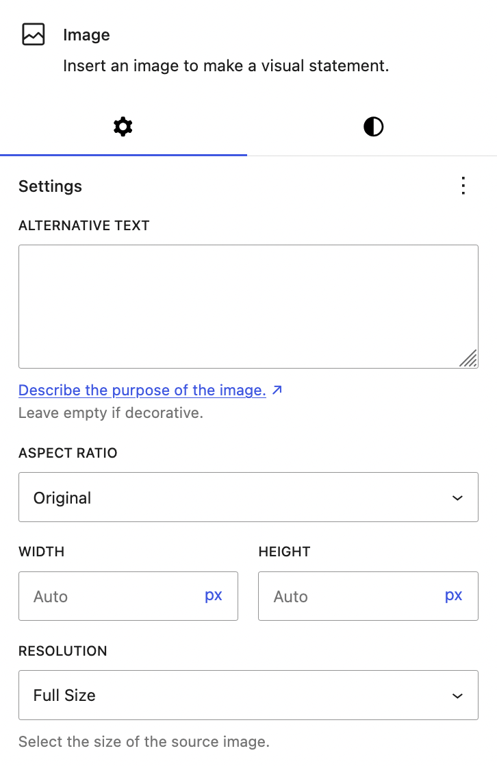
Image#
Inserts an image.
Features#
- Image Component: The image to be displayed, can be edited to change its alt text, aspect ratio, width, height, resolution
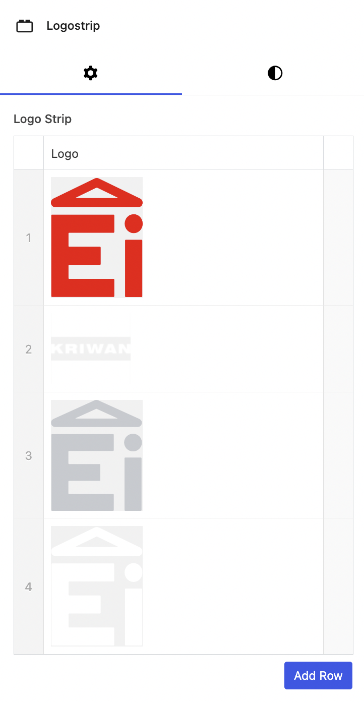
Logo Strip#
Inserts a strip of logo images.

Paragraph#
Inserts text into the content block.

Video#
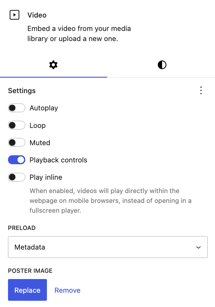
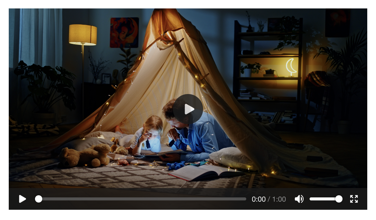
Inserts a video into the content block. The video can be set to autoplay, loop, muted, and played inline on mobile devices. Playback controls can also be visible.
Features#
- Settings: Various settings, such as autoplay and mute
- Poster image: Set the image shown on the element before it is played
